Merhaba değerli okurlarımız, bugün HTML ve CSS ile yaratıcı bir buton tasarlyacağız, sizi fazla tutmadan kodlarımıza geçelim.
HTML Kodları
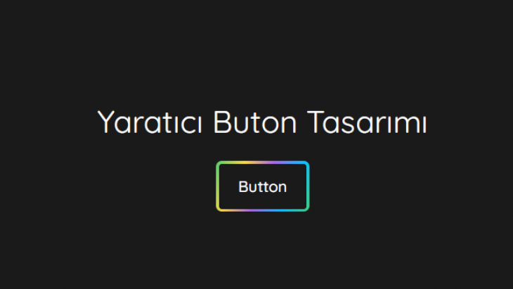
<center>
<h1>Yaratıcı Buton Tasarımı</h1>
	<a href="#" class="button">
	   <span>Button</span>
	</a>
</center>
CSS Kodları
@import url('https://fonts.googleapis.com/css2?family=Quicksand:wght@400;500&display=swap');

	body {
		background: #1a1a1a;
	}

	h1 {
		font-family: 'Quicksand', sans-serif;
		font-weight: 400;
		color: #fff;
		margin-top: 60px;
	}

	.button {
		display: inline-block;
		text-decoration: none;
		color: #fff;
		font-family: 'Quicksand', sans-serif;
		font-weight: 500;
		padding: 3px;
		border-radius: 6px;
		position: relative;
		overflow: hidden;
	}

	.button::before {
		content: "";
		position: absolute;
		top: 0;
		left: 0;
		width: 200%;
		height: 100%;
		background: linear-gradient(115deg, #4fcf70, #fad648, #a767e5, #12bcfe, #44ce7b);
		background-size: 50% 100%;
		border-radius: inherit;
	}

	.button:hover::before {
		animation: animate_border .75s linear infinite;
	}

	.button span{
		display: block;
		background-color: #1a1a1a;
		padding: 13px 20px;
		border-radius: 3px;
		position: relative;
		z-index: 2;
	}

	@keyframes animate_border {
		to {
			transform: translateX(-50%);
		}
	}

Yorumlar (0)